Cover All the Angles: How to tell if your engagement strategy is complete
May 15, 2018
By MobileUp Software
We have a lot of whiteboards here at MobileUp.
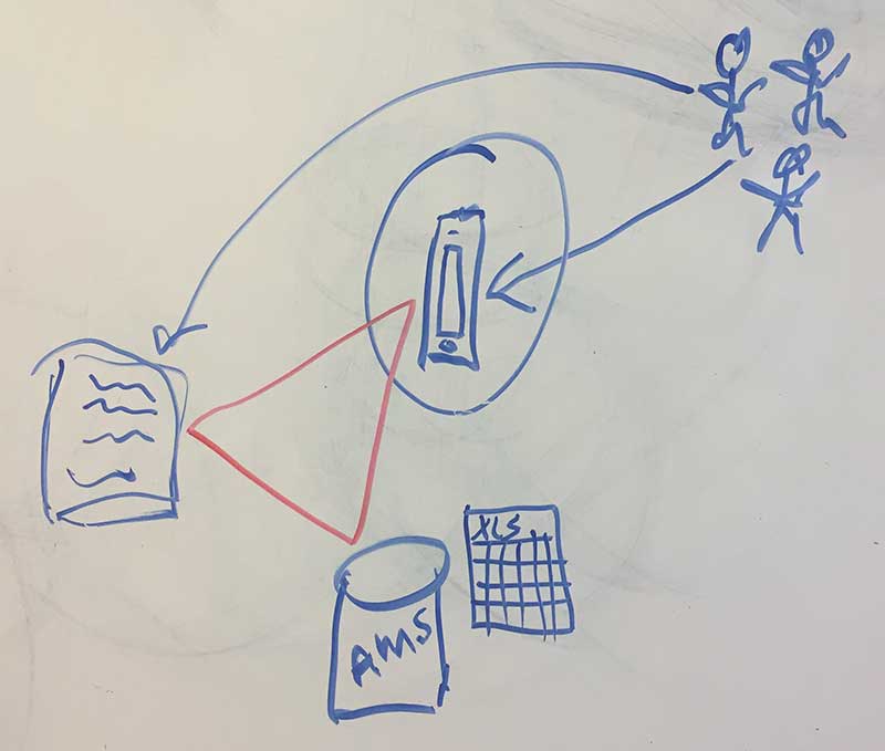
One not far from where this article is written contains the latest brainstorm we tentatively titled the Engagement Triangle.
Take a look:

Our Triangular Logic
The triangle is widely used in architecture because of its inherent ability to bear weight and provide strength.
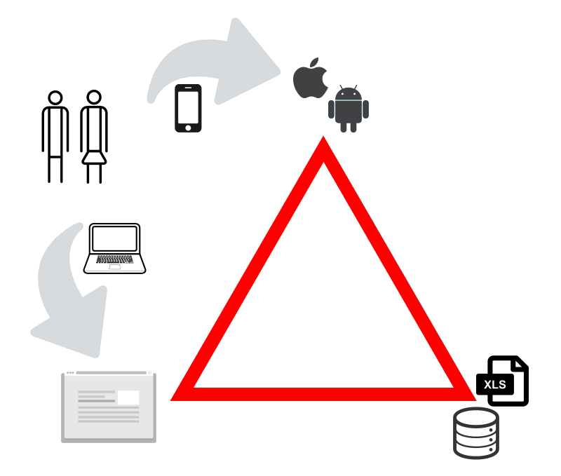
Similarly, the Engagement Triangle provides a solid foundation for any organization who is trying to reach its members, students, parents, or other constituents through the web for basic communications and engagement.
A cleaned up version of our triangle, then, might look like this:

When the Triangle Works: An association or school has a website, a native app, and a database (anything from an Excel file to a full featured AMS). When members or students access information from their organization, they receive personalized data in the most appropriate format for the device they are using.
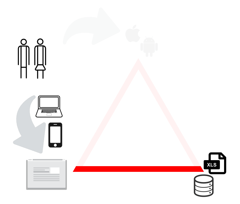
While it seems simple enough, we often encounter many associations and schools with an incomplete engagement strategy. They essentially have two points of the triangle in place with a website and a database, and all users receive the same information from the organization website.
Their version of the Engagement Triangle looks more like this:

When the Triangle Is Broken: User experiences suffer and engagement opportunities are missed when mobile audiences access the same content regardless of device.
No app? Know what you’re missing
If the incomplete triangle scenario applies to your association or school, you might wonder what you are missing without a native app to round out your engagement strategy.
Or you might also wonder why your responsive website isn’t good enough for the mobile users in your audience.
Quite simply: Websites fall short in delivering the experience your mobile users expect.
And as a result, they are unable or unwilling to fully engage with you at the levels you want.
There are many reasons for this.
- User Expectations: Smartphone adoption is undeniably widespread with an expected 238 million users in the US by 2018 and so is the use of apps with mobile users spending 89% of their time there versus 11% in the mobile web. If you’re asking your mobile users to connect to your information via a web browser, you are going against their habits.
- Performance: Apps are built for specific operating systems (e.g. iOS and Android) tuned to the devices where they are used. This combination of software and hardware leads to performance levels websites cannot match. Better performance translates to a better user experience and more frequent sessions.
- Functionality: Push notifications are an integral part of the app user experience and deliver timely messages that keep customers engaged with your association or school. Apps can access hardware features such as cameras and accelerometers, leading to more interactive features and a heightened user experience. Apps also retain user data, making the completion of forms and customization of information fast and easy.
- Visibility: App icons are visible when users explore their phones. This visibility elevates the brand awareness of your association or school and provides a simple and fast one-tap access to your information and engaging content.
Go from flat line to triangle
As you analyze your engagement strategy, set your goals on meeting the expectations of your users.
In many ways, native apps meet the needs of your smartphone users at a much higher level than websites. And despite the explosion in mobile usage numbers, your website is still one of the most important communication methods your organization has.
As our Engagement Triangle illustrates, they are complementary to each other and you need both to be at their best to reach your engagement and retention goals.

